How to Perform a Website Conversion Rate Optimisation Audit (Template Included)
If you’re driving traffic to your website but not seeing those visitors turn into paying customers, you might be missing a critical piece of the ROI puzzle. It’s time to take a closer look at your conversion rate!
In this guide, I’ll show you how to conduct a website conversion audit to pinpoint exactly where your site can improve, helping you convert more visitors into loyal customers.
The 3 Core Drivers of Business Growth
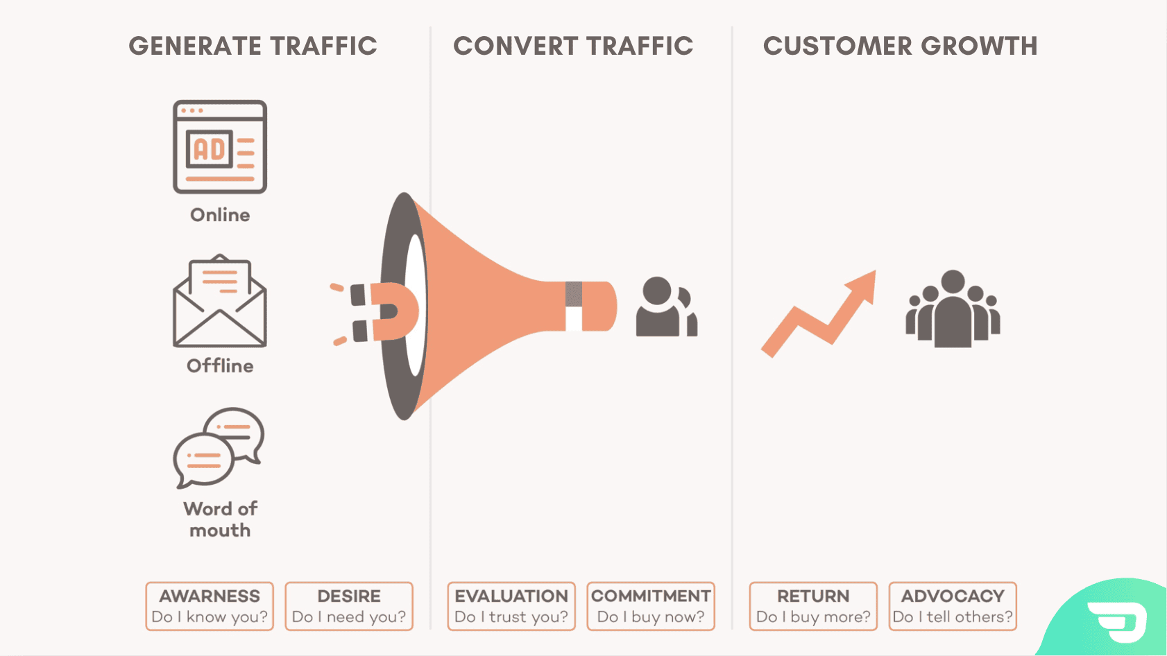
To grow your e-commerce business, there are three primary growth drivers you can leverage to improve results:
- Generate More Traffic: Getting people to visit your website.
- Improve Conversion Rate: Turning those visitors into paying customers.
- Lifetime Customer Value: Increasing the number of transactions per customer and their average transaction value.
In this post, we’re honing in on the second growth driver—converting visitors into customers. There’s no point in driving traffic to your site if it doesn’t do a great job of converting those visitors into paying customers in the first place. So, how do you make sure your site is optimised for conversion?
Well you need to start with a website conversion audit.
What is a Website Conversion Audit?
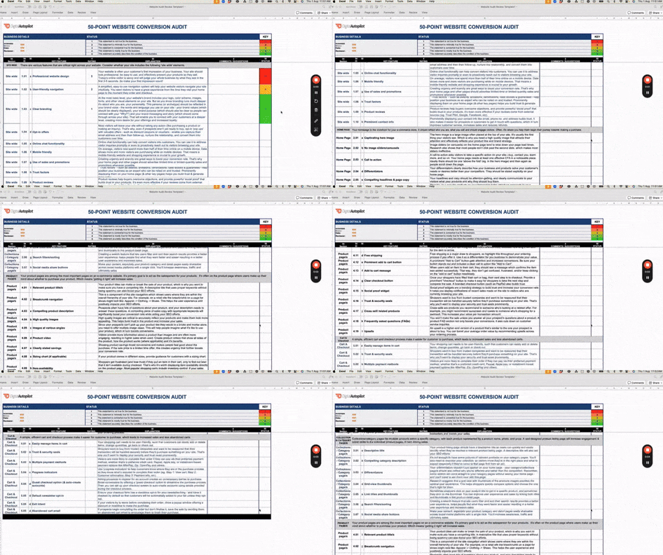
A website conversion audit is a detailed review of your site to evaluate how well it turns visitors into customers. By assessing key areas of your website, you can identify improvements that will increase your conversion rate. We’ve created a 50-point audit template to help you assess your website and start converting more traffic into sales (get your audit template here).
Below I’ll walk you through auditing your site for conversion killers with practical examples of what to do instead.
Start with the Customer Journey
Imagine a potential customer has landed on your site. Great—you’ve already activated the first growth driver by bringing them in, whether that’s through Google Shopping Ads or word-of-mouth referrals. But the real challenge is ahead: moving them from visitor to lead and/or buyer.
Your job now is to:
- Create desire for your product.
- Build trust by helping them evaluate your offerings.
- Inspire commitment by making it easy to buy and reducing as much risk as possible.
1. Evoke Desire: Capture Their Interest Right Away
Your first task is to make your visitor want what you’re offering, and a powerful way to do this is by ensuring your homepage has a captivating hero image. This is the first thing people see, so it needs to reflect your brand and instantly communicate value.
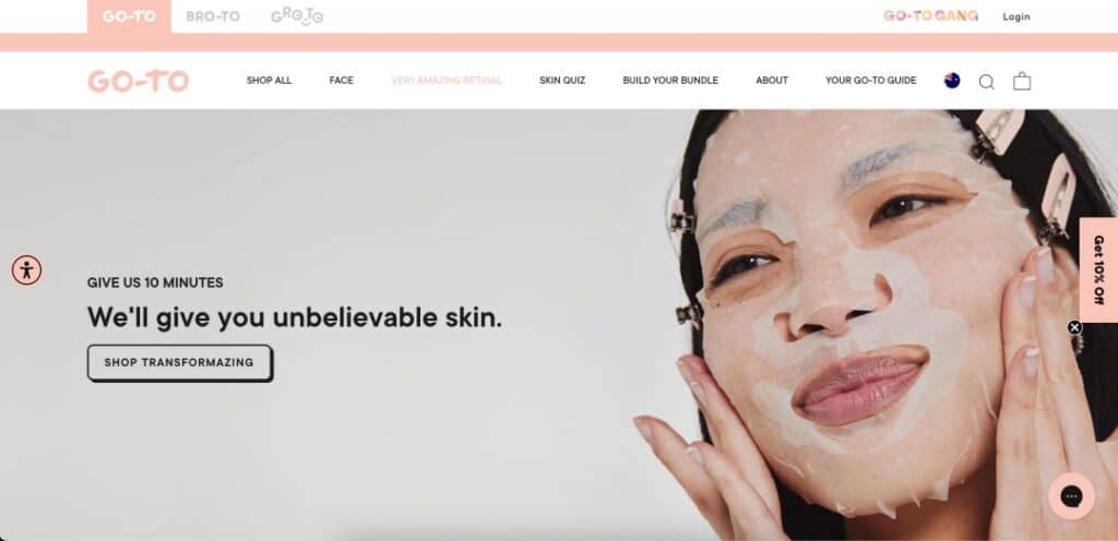
Let’s take the skincare brand Go-To as an example.

They’ve done a fantastic job with their hero image: it shows a person with glowing skin using one of their products, looking happy and confident. It’s simple yet effective—it immediately communicates that their product works and aligns with the brand’s promise of simple, effective skincare. This is how you create desire from the moment someone lands on your site.
You also must highlight your differentiators. What sets your product apart from the competition? Your visitors need to know this quickly and clearly. Go-To does this brilliantly by highlighting that their products are “worry-free, uncomplicated, effective, and cruelty-free.” This communicates not just benefits but values, which is a strong conversion driver.
2. Build Trust: Help Customers Evaluate Your Products
Desire alone won’t close the deal—you also need to build trust. Customers want to evaluate your product and feel confident that it will meet their needs.
One critical way to do this is through high-quality images. You’d be surprised how many sites fail to provide accurate, high-resolution images that show the product from multiple angles. These images help visitors evaluate your products visually, and get a better idea of exactly what they will receive – so your images need to help them do that! Take multiple high quality images that showcase your product – from receiving the box, opening it, to using it in a realistic way.
Product reviews are another powerful tool for building trust. Reviews provide unbiased social proof that other customers have had a good experience. For example, Go-To showcases nearly 900 customer reviews directly on their product pages, which gives potential buyers confidence that they’re making the right choice.

Another trust-building element is product videos. Videos give visitors more context than images alone and can show how the product is used. If possible, create videos that show your product from all sides, in the hands of multiple customer types, demonstrating its features in action.
3. Inspire Commitment: Make It Easy and Urgent
At this point, your visitor is interested and trusting, but you still need to push them to make the purchase. Here’s where you can make or break the sale.
First, ensure a user-friendly purchase process. Simple, clear navigation is crucial—don’t make it hard for visitors to find what they’re looking for. An intuitive site layout, easy-to-find search functionality, and an accessible shopping cart button are simple but essential elements of a streamlined purchase journey.
Creating a sense of urgency can also inspire commitment. Offer limited-time promotions or free shipping to encourage faster decision-making. For example, having a banner at the top of your site that says “Free shipping on all orders today!” can be just the nudge someone needs to complete their purchase.
Finally, ensure your checkout process is seamless. Offer multiple payment options, such as PayPal, credit cards, and instalment payment options like Afterpay or Zip Pay. The easier and faster it is for a customer to check out, the more likely they are to complete their purchase.
Ready to Audit Your Website?
We’ve created a 50-point website conversion audit to guide you through the process of optimising your site. This audit covers every essential conversion element, from your homepage to your product and checkout pages.

Here’s how to get started:
- Download the audit template here and rate your site on each conversion element.
- Focus on areas where you scored low—these are critical opportunities for improvement.
- Start making changes and measure the impact on your conversion rate.
If there are any changes you can’t implement yourself, or you’re unhappy with your results, reach out to us through our contact form.
Want Us to Audit Your Website? It’s Free and Includes a Digital Strategy Session
Let us handle the hard work for you. We’ll conduct a free website conversion audit and help identify areas to improve. Plus, you’ll get a digital strategy session to explore ways to boost your sales.


