Turn Browsers into Buyers with Lead Magnets for Ecommerce (With Examples)
Here’s a fun fact: if your site is converting more than 3% of traffic into sales, pat yourself on the back. You’re in the top 20% of stores. E-commerce conversion rates sit at a measly 2-3% on average. And if you’re looking at mobile, it’s even lower.
Shocking, right?
Let’s assume you’ve been putting the work into your site. You’ve made a bunch of optimisations, and you’ve cracked that 3% barrier. Awesome! Congratulations! Pop the champagne!
But here’s where most businesses drop the ball. They’re so focused on that 3% that they completely ignore the other 97% of visitors who came to the site but didn’t buy. Think about that for a second. If you’re converting 3%, that means 97% are walking away empty-handed.
Here’s what the typical customer journey is like for most online businesses. See if this looks familiar:
- You spend time, energy, and cold, hard cash to get visitors to your site. Maybe you’re killing it with google shopping ads or ecommerce SEO.
- A tiny fraction – that 2-3% – actually buy something.
- You deliver the goods to those customers.
The end.
That’s how most businesses operate. But what about that massive 97% who visited your site but didn’t buy? Most businesses write them off as “bad leads” and let them disappear into the ether with no way to contact them or follow up.
This is a massive missed opportunity. Because many of these aren’t bad leads at all. They’re just not ready to buy at this exact moment in time.
And that is where smart businesses separate themselves from the pack. They use a different strategy to attract and reel in their target audience to generate leads and more sales.
Enter opt-in offers – aka lead magnets.
In today’s post, we’re going to look at how to develop opt-in offers to help your site convert more website visitors into leads and sales, including those prospects who aren’t quite ready to buy yet.
Here’s what we’re going to cover:
- What lead magnets really are (spoiler: they’re not just fancy popups)
- Some killer examples of different kinds of lead magnets
- An overview of the best lead magnet ideas for eCommerce
- How to deploy a lead magnet on your own site for maximum impact and lead generation
Stick around, and I’ll show you how to tap into that 97% you’ve been missing out on and up your lead magnet game. Let’s dive in!
What is a Lead Magnet and Why is it Important for Ecommerce?
A lead magnet is a free, valuable resource that you provide to visitors in exchange for their contact information, typically their email address. It’s called a “lead magnet” because it attracts potential customers and draws them back into your sales funnel.
Why Lead Magnets Work
Lead magnets work because they:
- Provide immediate value to your prospects
- Allow you to capture leads’ contact information for follow-up
- Begin building a relationship with your potential customer
- Enable you to nurture leads until they’re ready to buy
The key to effective lead magnets is to provide something of immediate value to your target market. Some of these will take time to develop, but many can be created in under 10 minutes. Offering free stuff, such as samples or exclusive content, can significantly increase the appeal of your lead magnet.
Characteristics of a Good Lead Magnet
Creating an effective lead magnet is an art and a science. To truly capture the interest of your target audience and start generating leads, your lead magnet needs to possess certain key characteristics. Here’s what makes a lead magnet stand out:
- Relevance: Your lead magnet should be directly relevant to your target audience. It needs to address their specific interests, needs, or pain points. For instance, if you run an online fitness store, a lead magnet offering a free workout plan would be highly relevant to your potential customers.
- Value: The lead magnet must offer real value. This could be in the form of useful information, a solution to a problem, or even entertainment. The more valuable your lead magnet, the more likely visitors are to exchange their contact information for it. For example, offering free shipping on the first order can be a great lead magnet idea for an ecommerce store.
- Uniqueness: To stand out from the competition, your lead magnet should offer something unique. This could be a piece of content with original research and insights, a customer loyalty program with bonus gifts, or a clever giveaway or competition. A great lead magnet example is a personalised product recommendation quiz that provides tailored suggestions based on the user’s preferences.
- Accessibility: Your lead magnet should be easy to access and consume. Whether it’s a downloadable guide, a free sample, or a discount code, make sure it’s convenient for your audience to get and use.
- Measurable: Finally, a good lead magnet should be measurable. You need to be able to track its performance to understand its effectiveness. This means setting up systems to measure how many leads it generates, how engaged those leads are, and how many convert into customers.
By focusing on these characteristics, you can create lead magnets that not only attract potential customers but also drive real results for your business.
Popular Lead Magnet Ideas for Ecommerce
Let’s explore some examples of opt-in offers together:
Discounts and Coupons:
This is one of the fastest and easiest ecommerce lead magnets. All you need to do is decide on your discount and create an opt-in form on your site. For example:
- A $20 off instant coupon
- 10% off your first purchase
- 20% off your first order over $199
- Free shipping offer
- Highlight the rewards they will get with your loyalty program
High shipping costs can be a major barrier to purchase, so offer free shipping to address this pain point and increase conversions.
These offers are simple but effective – visitors just need to provide their email address to receive the discount.
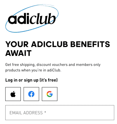
Adidas regularly runs discount big discount promos on their DTC site, and I’ve even bought a pair of tennis shoes for something like 60% off. See below how they deploy their discount offer.

Rewards Programs
Creating a rewards program is a great way to nurture visitors who aren’t quite ready to purchase yet and need a little nudge. Loyalty programs are also great for customer retention in ecommerce. Your rewards program should be based around racking up points that gives them access to exclusive deals and bonuses. This will be a little trickier to setup and monitor than a simple coupon code, but there are Shopify and Woocommerce apps and plugins that can do the heavy lifting for you.
Adidas is again doing an excellent job or this. Fill out your profile, share on social media, invite some friends by email and you’ll unlock a 20%, 30% discount (which can often be combined with other discounts) + a bonus when you purchase like a pair of socks.
Competitions:
Competitions are great when you want your lead magnet to go viral. For instance, you could offer visitors the chance to win a $1000 shopping spree or enter a draw to win a product you’ve just launched and want to promote.
But you should be strategic about it, otherwise you’re giving away value for little in return. For example, you might think that Play Station 5’s are in demand, so I’ll just give one of those away and get a lot of attention. If your business is targeting young males, then yes that makes sense. But if you’re a beauty brand then it’s unlikely to attract your target audience.
One of the best examples I saw recently was a guy who sells an SEO (Search Engine Optimisation) course. He was giving way a decades worth of subscription to a piece of SEO software called Screaming Frog (worth about $2500) – and if you shared it with your network you’d get extra entries. On the surface, it’s a very unsexy product for a giveaway competition. But, what kind of person would be interested in boring SEO software? SEO professionals and website owners – exactly the kind of person who would also buy an SEO course.
So if it’s not one of your own products you’re giving away, try and align it with what your ideal customer would absolutely love to get their hands on.
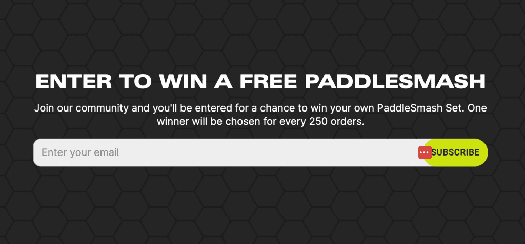
Another example is PaddleSmash. They’re trying to become the next Pickleball. But because they’re so new, they need to get their sets into the hands of people to try out and build some word of mouth. Combining that need with a competition that can bring exposure and build their email list is a great way of doing that, as you can see below.
Free Trials
This is great for software businesses. Companies like Dropbox use this effectively. They offer a “Try it free” option where users get either a limited time to use the service or a limited scope of the service. This allows potential customers to test out the product and see if they like it. Meanwhile, you get their contact details and can market to them, building the relationship over time and hopefully converting them to a paid version of the product.

Google also does this very well. They give you a ‘no credit card required’ Free 30 Day Trial to Google Workspace or Youtube Premium as long as you have a Google Account. Often, I’ve signed up to a free trial for a Google product and by the end of the 30 days it’s become a part of my daily life. Given the price is relatively low, I end up continuing to use (and pay) for it. Your product needs to be a truly great product for this to work though. They’re using the same strategy for their Gemini AI for Workspaces product, putting little notifications into people’s Gmails and Drive accounts.

Free Demonstrations
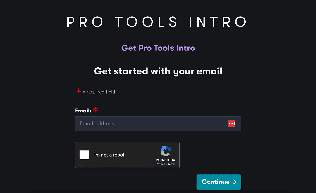
Just short of a free trial, this is a limited free version of the software or product vs free access to the full version. It can be a one-on-one demo, a video demo, or an interactive demo. You’re basically giving potential customers a look under the hood to help them make a purchase decision.
This is particularly good for high-end software, especially if it’s something they need to download to their computer to be able to use. Think video editors and audio production software. You could also offer early access to a new product or updated version of an existing product.
Interactive Surveys or Quizzes:
Quizzes and surveys are powerful tools in your lead magnet arsenal. They’re interactive, engaging, and can provide valuable insights about your audience. Many platforms like Typeform or Qzzr make it easy to create and embed quizzes. You can offer a short interactive survey, quiz, or assessment on a topic of interest to your target market.
Why Quizzes and Surveys Work:
- They’re interactive: People love to learn about themselves or test their knowledge.
- They provide value: Participants get personalised results or recommendations.
- They’re shareable: A fun quiz can quickly go viral on social media.
- They gather data: You learn more about your audience’s preferences and pain points.
The key is to create something your audience will find genuinely interesting or useful. A well-crafted quiz or survey can not only grow your email list but also provide valuable insights to help you better serve your customers.
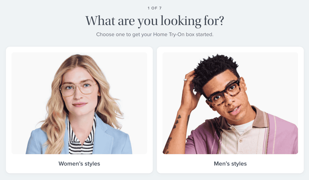
For example, an eyewear company might offer a quiz to help customers find the perfect sunglasses or eyeglasses for their face shape and style preferences. This not only provides value to the customer but also gives you valuable information about their preferences.
Warby Parker did just that and made it easy and fun to find glasses that suit your style and needs.
Free Samples
This approach is perfect when words and pictures can’t do a good job of selling the product – eg. perfume or boutique chocolates. They really need to smell or taste it to know if they like it. Sometimes it’s a physical sample that you might send out, but it could also be virtual samples. For instance, showing a picture of what the purchased item might look like in use – eg. a set of sporty wheels on your exact car. This gives customers a taste of what they’re buying without committing to a full purchase.
There are so many ways you can use free samples that it could be it’s own article. For example sports body care company bluerub includes a free sample with every order for a different product than the one they purchased. The result? They convert a whopping 40% of one-customers into buying the product they sampled.
High-end cosmetics brand SkinCeuticals are so confident that once you try, you’ll make a future purchase they feature their “deluxe samples” on the homepage.

If you don’t want to give away a sample for free, you could charge a small amount for a sample (eg. $5) to cover costs, but offer to subtract that amount from their order if they upgrade to the full version.
Guides, eBooks, Whitepapers and Reports:
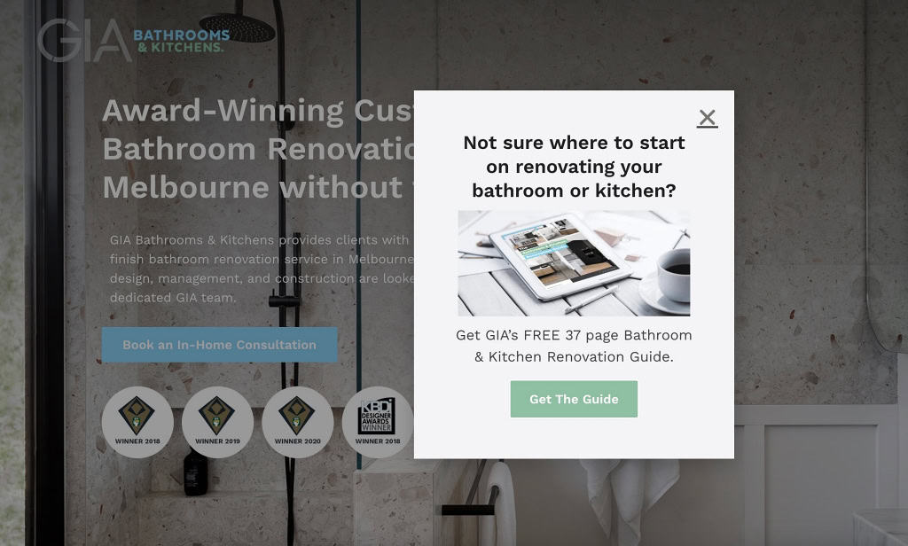
These offer tips, strategies, and tactics to help your target market reach their goals. The best part? They can be created at no-cost (other than your time) and with a short turnaround time. Have you written blogs or articles for your business? If they’re valuable and genuinely helpful to your target market, use them. Repurpose them into free reports, guides, or ebooks. If you’ve written a series of articles on the same topic, even better.
You don’t even need to rewrite them necessarily. If they’re genuinely useful, you can simply repackage them into a single PDF document with a nice, professional looking design. Boom – you have an ebook. Remember, you don’t have to write the next bestselling novel to do this effectively! In fact, sometimes more concise, condensed information is more valuable to your target market – eg. a cheatsheet.
These kinds of lead magnets are great if you sell software, courses, memberships, or any kind of service or product that solves a problem and requires a degree of education.
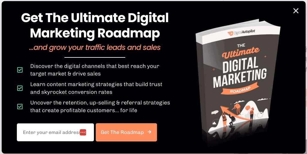
We use them on our website – just take a look at our Digital Marketing Roadmap below hint hint
Checklists and Templates:
These are typically short, one to two-page documents that provide prospects with practical help on a specific topic or task important to them. Ask yourself: do you ever use any checklists, templates, or tools when you work with your customers? If so, you could simply choose one of them, adapt it, and offer it for free. The only proviso is that it should be of immediate value to them.
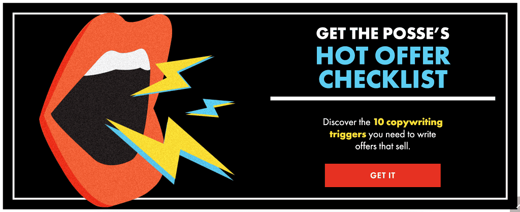
You’re not limited to these lead magnet examples – these are just some common ones that businesses use effectively. Brainstorm with your team about what would be genuinely valuable to your target market. If your offer feels lazy and stingy, it won’t attract people to sign up, or worse, they’ll be disappointed when they do – and that’s no way to build an ongoing relationship!
Btw don’t forget to download your copy of the lead magnet creation template which is a companion to this article.
How to Deploy Opt-in Offers on Your Website
Now that you’ve decided on your lead magnet idea and crafted your opt-in offer, the next step is to ensure your visitors actually see it so you can generate more leads. After all, for your lead magnet to work its magic, it needs to be visible and enticing to your prospects. Let’s explore how to integrate a lead magnet into your website in a way that gets people’s attention without being annoying or obtrusive.
In-Content Offers
These are opt-in opportunities that you weave right into your content. Here’s how it works: You’re reading an article, maybe about the “Top 10 Fashion Trends for Summer,” and boom! Halfway through, there’s an offer for a free ebook on “Building Your Perfect Summer Wardrobe.” It’s relevant, it’s timely, and it doesn’t interrupt the flow of the content.
Why does this work so well? Simple:
- It’s targeted: The person reading your content is already interested in the topic. Your offer is like the cherry on top.
- It’s non-intrusive: Unlike popups, in-content offers don’t interrupt the user’s experience. They’re there if you want them, easy to ignore if you don’t.
- It adds value: When done right, these offers enhance the content instead of distracting from it.
It could be as simple as a bolded headline that links to a page with a form on it. The key is that the offer is extremely relevant to the content they’re reading. You could even just offer a PDF version of the blog post for them to download, or a 1-page cheatsheet with key-takeaways from the blog post. Here’s an example from Hubspot’s blog:

Exit Intent Popups:
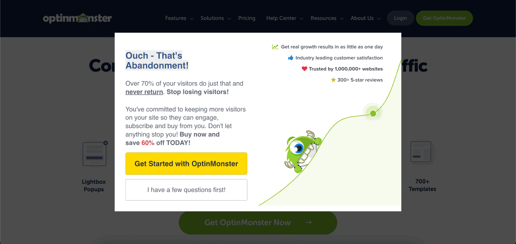
A go-to that we use a lot with our clients. We love this one because it’s a good compromise between being very obvious without ruining the browsing experience. It also converts very well. It works like this: A visitor browses your website and then at some point moves their mouse to leave your site. The popup software detects this, and a popup appears with a (hopefully) compelling offer.
The beauty of this method is that it allows visitors to browse your site freely without interruption. The popup only shows up when they’re about to leave. It gives you one last shot at capturing some of these visitors that would otherwise be lost. It’s like a friendly goodbye that says, “Wait! Don’t forget this valuable offer before you go!”
Timed Popups:
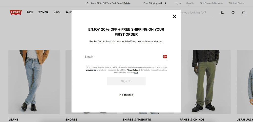
With this method, the popup appears after a designated period of time. For example, you might want people to browse your site unhindered for 30 seconds, a minute, or two minutes before your offer appears. This approach gives visitors a chance to engage with your content first, potentially increasing the likelihood they’ll be interested in your offer when it appears. You can experiment with different timing to find what works best for your audience.
The advantage of this popup over the exit intent is you can show visitors an offer while they’re still evaluating your website which can nudge them over the line. The disadvantage is it interrupts their browsing experience and is therefore more obtrusive. So you need to make sure the offer is very relevant to them and worth their time and attention. To achieve this, you could set different popups with different offers depending on what product/service they’re looking at.
Scroll Boxes
Scroll boxes are small boxes that typically appear in the bottom right or bottom left corner of your site as you scroll down the page. As the user moves through your content, the box smoothly (or abruptly – it’s up to you) slides into view, offering your lead magnet. This method is less intrusive than full-screen popups but can still be effective in nudging visitors to take an action and become a lead.

Floating Bars
These are slim bars that appear either at the top or bottom of the website window and stay in place as visitors scroll. They’re a great option for less obtrusive, always-visible calls-to-action. You can use them to highlight your opt-in offer consistently throughout the user’s browsing experience. For example, you might have a bar at the top of your site that says, “Get 10% off your first order! Click here to sign up.”

When deciding how to deploy your opt-in offers, consider your website’s overall design and user experience. You want to strike a balance between making your offer visible without annoying your visitors with overly aggressive popups.
The key is to test different deployment methods and see what works best for your specific audience and offer. Don’t be afraid to experiment and refine your approach based on the results you see.
Depending on the software you go with, you can also set conditions so that the opt-in offer won’t show to the visitor based on certain conditions. For example, you might want to hide your lead magnet from existing customers. Or you might only want to show it if someone has looked at specific pages on your site.
Install Popup/Optin Software
Speaking of software, unless you have a developer on staff, you’ll need software or a plugin to implement your optin offer. There are a lot of options on the market, from the very basic that can only do simple notification bars, to the advanced that can do every type of scrollbox and popup under the sun.
Some are platform specific – eg. WordPress plugins and Shopify Apps – and some can be deployed on virtually any website – eg. Optinmonster.

These are some of our favourites that we use most often (in no particular order):
- Optin Monster for the most advanced and complete feature set. Pricey though.
- Hustle (WordPress Plugin). Easy to use and setup and the free version will be enough to begin with. Good for scrollboxes and simple popups.
- Elementor Pro. If your site is on WordPress and already using the Elementor page builder, this is the go-to. You can use it to create contact forms, in-content opt-in offers, as well as popups.
- Klaviyo. Excellent ecommerce email marketing platform, but their popups are pretty good too.
If you know what you’re doing, it’s not too difficult to set these up, and the better software will have in-depth guides and support to help you.
However, if you need help designing and implementing a lead magnet, send us a message through our contact form or book a free strategy session.
Measuring the Success of Lead Magnets

Alright, so you’ve got your lead magnets up and running. Great job! But hold on, we’re not done yet. Now comes the fun part – figuring out if they’re actually working. I mean, what’s the point of all this effort if we don’t know if it’s paying off, right?
To do that we’re going to look at a few key things:
- Conversion Rate: How many people are actually signing up as a percentage of unique visitors? For popups you’re aiming for 10%, scroll boxes and less obvious popups you’re aiming for 5%. This is obviously a very ball-park figure because conversion rates will vary based on what industry you’re in, how generous the offer is, and the design and copy of the optin offer itself. For example free shipping will have a lower conversion rate than a 30% discount but it will be less costly to you, so you have to find a balance.
- Lead Quality: Not all leads are created equal and you want to make sure you’re attracting the right kind of visitors. For example, if you’re selling high-end software and your free trial is attracting CEOs and tech leaders, you’re on the right track.
- Email Open Rate: This one’s pretty simple. Are people actually opening the emails you’re sending with your lead magnet? If not, you might need to jazz up your subject lines a bit. For your welcome/delivery email you want at least 50% open rate. Subsequent emails in a sequence will have a drop off in open rates – eg. email 2 might get 40%, email 3 might get 35% etc. If you send a weekly or monthly newsletter anything above 20% is above average.
- Lead Magnet ROI: Last but definitely not least, is your lead magnet making you money? At the end of the day, we’re running a business here. Compare what you’re spending on creating and promoting your lead magnet to the revenue it’s generating. You can track this with Google Analytics and unique coupon codes.
By keeping an eye on these metrics, you’ll get a pretty good idea of how your lead magnets are performing. You can use this info to make them even more effective!
Implementing Opt-in Offers: A Step-by-Step Guide
We’ve looked at opt-in offers and how to use them. Now, let’s set one up together. For a more detailed video walkthrough plus a lead magnet creation template, click here.
Choose Your Offer:
First things first, you need to decide what type of opt-in offer will be most valuable to your target market. Think about your audience – what do they need? What problems can you solve for them? Here’s a quick exercise:
- Get out a blank piece of paper or use a whiteboard
- List your customers top 3 pain points
- Brainstorm how you can address each one with a free resource
- Evaluate which idea provides the most immediate value
The goal is to provide something so valuable that your prospects are willing to exchange their contact
Set Up Your Email Marketing System:
Before you deploy your offer, make sure you have a system in place to collect email addresses and send marketing emails. If you haven’t already, sign up for an email marketing service like Mailchimp, Klaviyo, or ActiveCampaign. These platforms will help you:
- Create signup forms
- Store your contacts
- Send automated emails
- Track your results
Click here to learn more about email marketing.
Create Your Opt-in Form:
Using your email marketing system or a tool like OptinMonster, create the form that visitors will use to sign up for your offer. Keep it simple – usually, just asking for a name and email address is enough. Remember to:
- Write a compelling headline that highlights the value of your offer
- Keep the form fields to a minimum to reduce friction. As a general rule of thumb, the more contact details you ask for, the more valuable your lead magnet has to be.
- Include a clear call-to-action button (e.g., “Get My Free Guide”)
Set Up Delivery of Your Offer:
Decide how you’ll deliver your opt-in offer. Will it be:
- An immediate download on a thank you page?
- Sent via email?
- Access to a members-only area of your website?
Whatever you choose, make sure the process is smooth and immediate. If you’re sending via email, set up an automated welcome email that delivers the offer right away.
Test Your Opt-in Offer:
Before you go live, test everything thoroughly. Sign up through your own form and make sure:
- The form submits correctly
- You receive the confirmation email (if applicable)
- The offer is delivered as expected
- The popup or form appears correctly on different devices (desktop, mobile, tablet)
Optimise and Iterate:
Based on your results, continually refine your opt-in offer:
- Test different types of offers
- Try various deployment methods
- Experiment with your form copy and design
The better optin softwares will have split-testing capabilities which means you’ll be able to run 2 different offers that receive a 50/50 split in traffic so you can easily compare and pick a winner.
Optimisation is an ongoing process. What works today might not work as well in six months, so keep testing and improving.
Implementing opt-in offers might seem like a lot of work, but it’s worth it. By capturing those visitors who aren’t ready to buy today, you’re building a valuable list of potential customers. Nurture these relationships over time, and you’ll see your sales grow.
Get Started Creating Your Own Lead Magnet Today
Download our lead magnet ideation and creation template which comes with a companion walkthrough video.
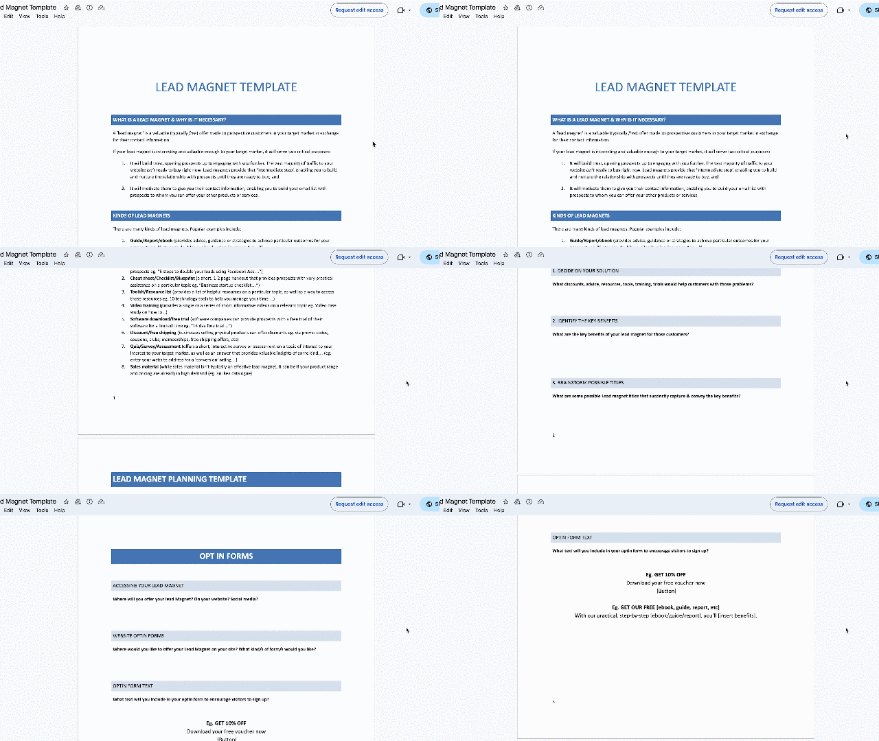
Here’s how to get started:
- Download the lead magnet template here.
- Watch the 13 minute training video where I walk you through how to create your own lead magnet
- Use the template to develop a lead magnet for your business
- Deploy the lead magnet on your website
If you’re unsure about what lead magnet type is right for your business, or need help developing a lead generation strategy, sign up for a free website audit and strategy session below.

